Data Visualisation using ggplot
Learning Objectives
- Understand that there is basic R plotting (eg histograms) and more popular ggplot2 package plots (for everything else).
- Customise the aesthetics of an existing plot.
- Export plots from RStudio to standard graphical file formats.
- Add basic statistical testing to your plots.
Basic plots in R (Histogram)
The mathematician Richard Hamming once said, “The purpose of computing is insight, not numbers”, and the best way to develop insight is often to visualise data. Visualisation deserves an entire lecture (or course) of its own, but we can explore a few features of R’s plotting packages.
When we are working with large sets of numbers, it can be useful to display that information graphically. R has several built-in tools for basic graph types such as histograms, scatter plots, bar charts, boxplots and much more.
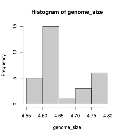
However, for most people, you would only use the histogram function in base R plots. We will test that out on the genome size of our metadata.
genome_size <- metadata$genome_size
We can do this by using the hist function:
hist(genome_size)
Better figures (ggplot2)
More recently, R users have shifted away from base graphic options and toward a plotting package called ggplot2, which adds significant functionality to the basic plots seen above. The syntax takes some getting used to but it’s extremely powerful and flexible. Let’s try out a basic scatterplot.
ggplot2 is best used on data in the data.frame form, so we will work with metadata for the following figures. Let’s start by loading the ggplot2 library.
library("ggplot2")
The ggplot() function is used to initialise the basic graph structure, and then we add to it. The basic idea is that you specify different parts of the plot and add them together using the + operator.
We will start with a blank plot and add layers as we progress.
ggplot(data = metadata)
Geometric objects are the actual marks we put on a plot. Examples include:
- points (
geom_point, for scatter plots, dot plots, etc) - lines (
geom_line, for time series, trend lines, etc) - boxplot (
geom_boxplot, for, well, boxplots!) - barchart (
geom_barorgeom_coldepending on whether you table needs to be “counted” or is already counted) - labels/text (
geom_textto add annotations to your plots)
However, really the number of plots is endless. This website shows a summary of the types:
A plot must have at least one geom; there is no upper limit. You can add a geom to a plot using the + operator
ggplot(data = metadata) +
    geom_point()
For each geom, you need 2 essential arguments satisfied to create a plot:
datamapping(aesthetics)
[!IMPORTANT] While you don’t strictly need to define
data = metadataormapping = aes(), it is highly recommended to explicitly define this for beginners. This will reduce chance of errors if you accidentally put things in the wrong order. Whilegeom_point(metadata, aes(x = x, y = y)could work, you might run into trouble with the order of arguments if you’re not careful, especially when you start creating complicated plots!
Anything in ggplot() gets applied to all added geoms. So here, data = metadata is getting passed to geom_point already.
Geoms usually need a required set of aesthetics to be set, and usually accepts only a subset of all aesthetics – refer to the geom help pages to see what mappings each geom accepts.
Aesthetic mappings are set with the aes() function. Examples include:
- x (variable for the x axes)
- y (variable for the y axes)
- colour (variable for outline)
- fill (variable for “inside” colour)
To start, we will add the column names that correspond to the variable we want to set for the x- and y-values.
geom_point requires aes() arguments for x and y, all other arguments are optional.
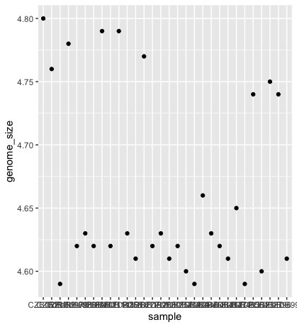
We will run the most basic scatterplot of sample against genome size.
ggplot(data = metadata) +
    geom_point(mapping = aes(x = sample, y= genome_size))
[!IMPORTANT] Common beginner mistake: If you have these aesthetics inside aes() e.g.
geom_point(aes(fill = variable))then every unique value in the “variable” column will be assigned a unique fill colour. If you want ALL items to be the same colour, then you put the fill argument in geom_point instead e.g.geom_point(fill = 'red')now all items will be red. If you dogeom_point(fill = variable), you will probably get an error.
The problem is that the labels on the x-axis are quite hard to read. To change this, we need to add a theme layer. The ggplot2 theme system handles non-data plot information such as:
- Axis labels
- Plot background
- Facet label background
- Legend appearance
We have built-in themes to use, or we can adjust specific elements.
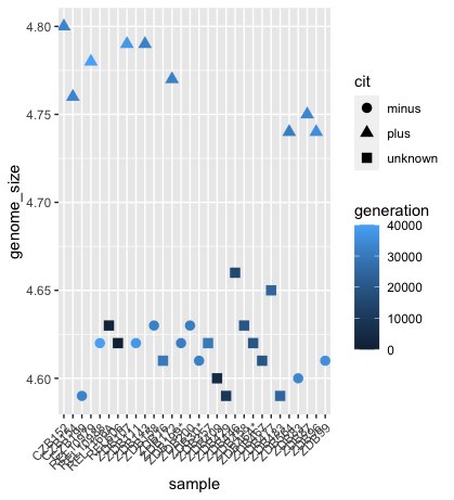
For our figure, we will change the x-axis labels to be plotted on a 45-degree angle with a small horizontal shift to avoid overlap.
We will also add some additional aesthetics by assigning them to other variables in our dataframe.
For example, the colour of the points will reflect the number of generations and the shape will reflect citrate mutant status. The size of the points can be adjusted within the geom_point but does not need to be included in aes() since the value is not assigned to a variable.
ggplot(data = metadata) +
    geom_point(mapping = aes(x = sample, y= genome_size, color = generation, shape = cit), size = rel(3.0)) +
    theme(axis.text.x = element_text(angle=45, hjust=1))
Custom colours
The default ggplot2 colours can be quite ugly - continuous scales are ESPECIALLY bad. For best data visualisation, you want to choose colours that are intuitively associated with what you are trying to distinguish.
e.g. Hot = red, cold = blue, plants = green, etc. For discrete but ORDERED data e.g. low, medium, high, aim to choose the same colour, but darker as it gets higher. e.g low = light blue, medium = medium blue, high = navy to keep things intuitive! Alternatively, you could have low = blue, high = red. It depends on whether you want the data to be shown as diverging.
Careful and prudent choice of colours and palettes can go a LONG way in making your plots more readable!
You also want to consider colourblind-friendly colour palettes.
For continuous data, viridis is often the package of choice. They are colourblind friendly with high contrast and generally pleasant to look at. You can now use it with ggplot2 without having to load the specific package. Let’s try replacing the default colours for generation.
This is done using the scale_colour/fill family of functions.
ggplot(data = metadata) +
  geom_point(mapping = aes(x = sample, y= genome_size, color = generation, shape = cit), size = rel(3.0)) +
  scale_colour_viridis_c(option = 'magma') +
  theme(axis.text.x = element_text(angle=45, hjust=1))
Already much clearer!
Viridis supports discrete data as well with scale_colour_viridis_d. However, for discrete colour palettes, Colourbrewer is a popular option. Alternatively, you can always select your own colours by providing "#HEXCODE" or the ggplot2 name of the colour.
More info on how to use colours can be found here.
Advanced tip!
For discrete values, I always recommend having a named vector for repeated colours throughout your dataset to keep colours consistent throughout your study. e.g. T cells always in green, B cells always in blue, macrophages always in yellow etc.
# Your named vector
cell_colours <- c('Tcell' = 'green', 'Bcell' = 'blue', 'macrophage', = 'yellow')

# Apply with the manual family
scale_fill_manual(values = cell_colours)
Exercise
Try making a scatterplot of genome size vs generation.
Advanced Try out some of the advanced visualisation extras and see if you can revamp this plot to look better - group by cit for example!
Writing figures to a file
In Rstudio, there are 3 ways in which figures and plots can be output to a file (rather than simply displaying on screen). The first (and easiest) is to export directly from the RStudio ‘Plots’ panel, by clicking on Export when the image is plotted. This will give you the option of png or pdf and selecting the directory to which you wish to save it to.
However, what if you forgot the dimensions you chose last time? And now your new plot with slightly different dimensions looks squashed in comparison. Very annoying. This is where the other 2 methods come in handy.
For the other 2 methods, I would recommend as best practise to assign the plots to an object. This is the common convention e.g.
p <- ggplot()
Option 2: pdf(), png(), etc functions with dev.off
These functions initialise a plot that will be written directly to a file in the pdf or png format, respectively. Within the function, you will need to specify a name for your image in quotes and the width and height. Specifying the width and height is optional, but can be very useful if you are using the figure in a paper or presentation and need it to have a particular resolution. Note that the default units for image dimensions are either pixels (for png) or inches (for pdf). To save a plot to a file, you need to:
- Initialise the plot using the function that corresponds to the type of file you want to make:
pdf("filename") - Write the code that makes the plot or if you assigned the plot to an object just use the object e.g.
- Close the connection to the new file (with your plot) using
dev.off().
## start by making a figures folder
dir.create("figures")

# this works!
pdf("figures/scatter.pdf")

ggplot(metadata) +
   geom_point(aes(x = sample, y= genome_size, color = generation, shape = cit), size = rel(3.0)) +
   theme(axis.text.x = element_text(angle=45, hjust=1))

   dev.off()

# this also works!
p <- ggplot(metadata) +
       geom_point(aes(x = sample, y= genome_size, color = generation, shape = cit), size = rel(3.0)) +
       theme(axis.text.x = element_text(angle=45, hjust=1))

pdf("figures/scatter_p.pdf")

p

dev.off()
Option 3. ggsave family of functions - only works for ggplot objects but very powerful. This is the preferred method of plot saving for most people as it is easy to automate the saving of many plots.
p <- ggplot(metadata) +
      geom_point(aes(x = sample, y= genome_size, color = generation, shape = cit), size = rel(3.0)) +
      theme(axis.text.x = element_text(angle=45, hjust=1))

ggsave('figures/scatter_ggsave.pdf', p, height = 6, width = 4)
Integrating statistical tests into your plot
Utilise ggpubr to make it easier to interact with ggplot and integrate statistics. Different statistical tests are appropriate depending on the number of groups and the distribution of the data within the groups.
This isn’t a statistics class, so we won’t cover all available methods. However, we’ll walk through the logic for choosing a suitable test for this dataset.
Step-by-step: Choosing the appropriate test:
-
Data type. i. genome_size is numeric. ii. cit is a categorical variable with three levels: “plus”, “minus”, and “unknown”.
-
What are we comparing? i. We’re interested in whether genome size differs between citrate-utilisation groups (cit status). ii. We will perform pairwise comparisons: “minus” vs “plus”, “unknown” vs “plus” and “minus” vs “unknown”.
-
Group sizes. These are relatively small sample sizes.
 table(metadata$cit)
#minus  plus    unknown
#  9       9      12
- Data distribution and normality. While formal normality tests (e.g.,
shapiro.test()orks.test()) can be used, small sample sizes and the presence of tied values (e.g., repeated 4.62, 4.63) already suggest that the data likely violate normality assumptions. The standard deviations are small, and visual inspections show limited spread within each group.
Choosing the test because:
- The data are numeric
- The group sizes are small
- There are tied values and limited variance
- And we are comparing group medians across pairs of groups.
We choose the Wilcoxon rank-sum test (a non-parametric alternative to the t-test) for pairwise comparisons. For testing across all three groups simultaneously, we would use the Kruskal–Wallis test; however, that’s not necessary here, as we’re interested in pairwise differences.
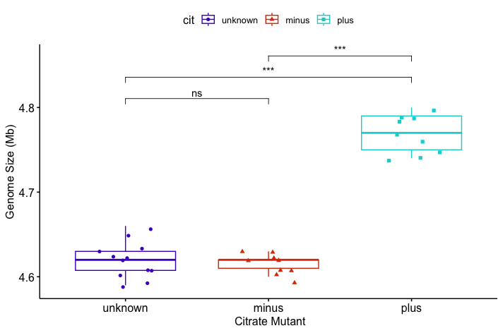
For visualisation, you’ll need to install the ggubr package, load it into your library, and plot your boxplot.
# Install and load ggpubr
install.packages("ggpubr")
library(ggpubr)

# Visualise with a boxplot
p <- ggboxplot(metadata, x = "cit", y = "genome_size",
               color = "cit",
               palette = c("#4D00C7", "#DA3C07", "#05D3D3"),
               add = "jitter", shape = "cit") +
     xlab("Citrate Mutant") + ylab("Genome Size (Mb)")

# Define pairwise comparisons
my_comparisons <- list(c("unknown", "minus"),
                       c("unknown", "plus"),
                       c("minus", "plus"))

# Add Wilcoxon test results with significance labels
p + stat_compare_means(comparisons = my_comparisons,
                       method = "wilcox.test",
                       label = "p.signif",
                       exact = FALSE  # avoid warning with ties)
You might get a warning:
Warning messages:
1: In wilcox.test.default(...):
  cannot compute exact p-value with ties
This occurs because the Wilcoxon rank-sum test (also called the Mann–Whitney U test) attempts to compute an exact p-value by default. However, this method assumes that all values are unique. When your data contains tied values—as is the case here with repeated measurements like 4.62 and 4.63—the exact method is no longer valid. In such cases, the test automatically switches to an approximate method (based on a normal approximation) and raises this warning.
Resources:
We have only scratched the surface here. To learn more, see the ggplot2 reference site, and Winston Chang’s excellent Cookbook for R site.
Though slightly out of date, ggplot2: Elegant Graphics for Data Analysis is still the definitive book on this subject. Much of the material here wasadaptedd from Introduction to R graphics with ggplot2 Tutorial at IQSS.
To investigate more into colour palettes viridis
Material adapted from (https://datacarpentry.org/R-genomics/01-intro-to-R.html) and (https://datacarpentry.org/semester-biology/materials/r-intro/) by Helen King. Further revisions by the Data Science Platform
Data Carpentry, 2017-2018. License. Contributing.